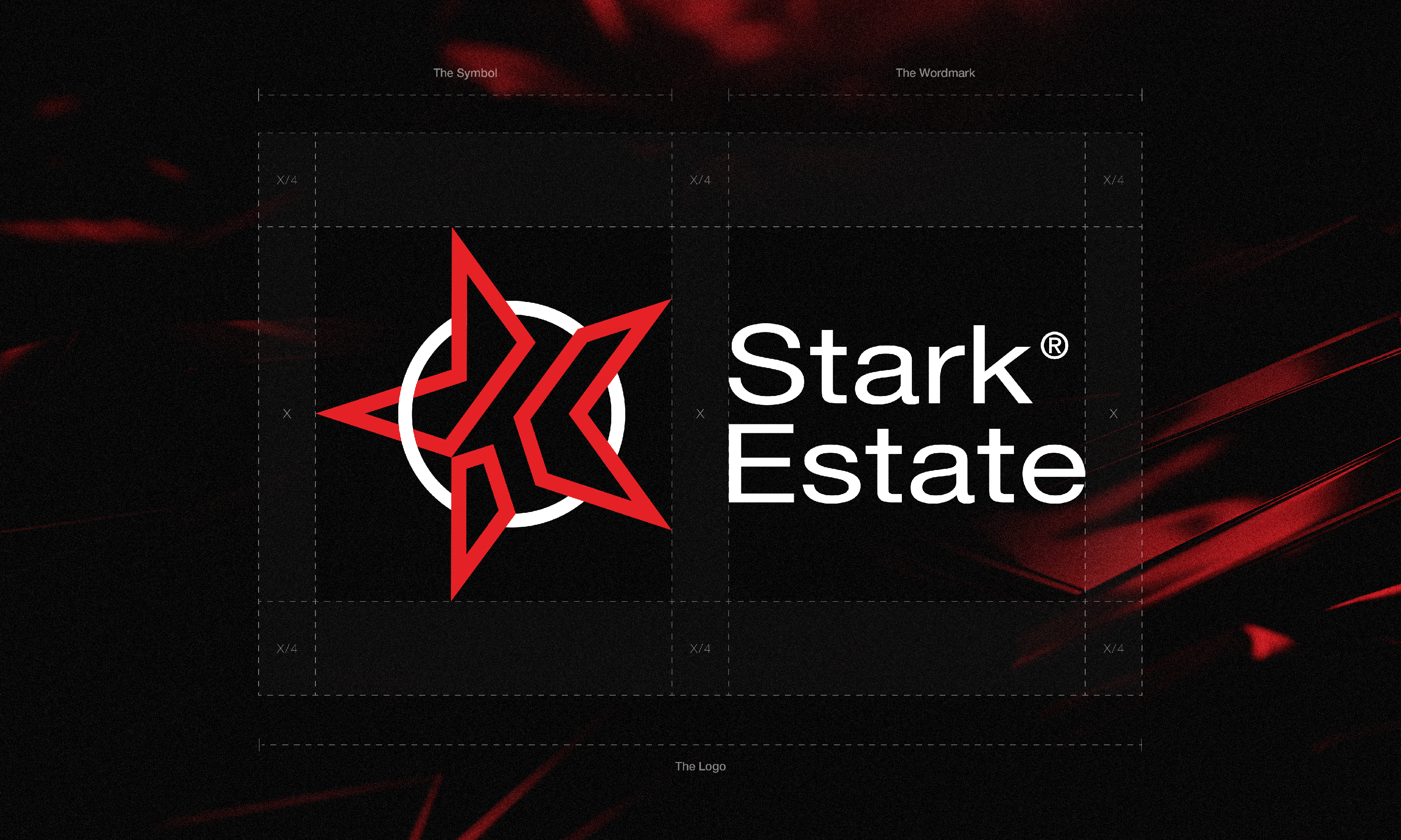
One of my recent projects that I'm really pleased with, even though the client wasn't ultimately convinced. I'm constantly refining the presentation of my work and I think it's really good here too. --- The Star: The central element of the logo is a red star, which directly relates to the name Stark. In English, "star" signifies a celestial body, creating a direct link to the company's name. The color red symbolizes passion, energy, and determination, which are key to Stark Estate's ethos. The Letter K: Within the star, the letter K is incorporated. This letter, being the last in the name Stark, is subtly integrated into the star's shape, creating a unique symbol - Star+K. This clever combination creates a direct reference to the company name, adding an element of creativity and uniqueness. The Outline of a Roof: At the center of the logo, subtly placed is an outline of a roof. This element relates to the real estate industry, which Stark Estate operates in. The roof outline symbolizes home, safety, and stability - values that Stark Estate wishes to convey to its clients. Each element of the Stark Estate logo has been thoughtfully designed to reflect the company's values, its name, and the industry it operates in. Together, they form a cohesive and striking representation of the Stark Estate brand. ---







Rekomendowane komentarze
Brak komentarzy do wyświetlenia
Dołącz do dyskusji
Możesz dodać zawartość już teraz a zarejestrować się później. Jeśli posiadasz już konto, zaloguj się aby dodać zawartość za jego pomocą.